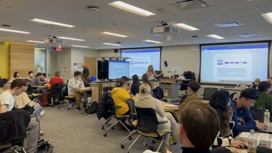
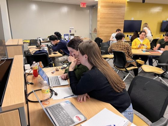
On March 23, 2022, the Quantitative Methods in the Social Sciences (QMSS) Department at the University of Michigan held VIZ’D–a data visualization competition for QMSS students to showcase their visualization skills using Excel and Tableau and compete for awesome prizes and, of course, bragging rights to their QMSS friends. The event brought together a fantastic group of students to both compete, judge and make up the audience!
Akin to Chopped on Food Network, the data visualization competition featured an appetizer round and a main course round. The contestants were given a ‘basket’ of data and were allowed a fixed time to create visualizations to answer the prompt given at the beginning of the round. What’s the prize for winning the round? The winners of each round had better odds of getting first crack at the very coveted prizes! While the ‘data chefs’ were working, QMSS graduate student instructors were navigating their way through the tables to assist any competitors with troubles or technical questions, but the teams were largely independent and had to work quickly! In the spirit of March, the ‘baskets’ of data for the night were centered around the March Madness NCAA basketball tournaments for both the men’s and women’s teams. Viz’d participants were told that they were “part of the communication team that wants to inform students, boosters and major donors about the University of Michigan basketball programs.” Great Division 1 basketball programs are hoped to provide a university with visibility and allegiant alumni. In pursuit of those goals, the fictional “communications team” participants were tasked with creating enthusiasm about the University of Michigan’s basketball programs and its athletics in general. The competitors were reminded that, of course, whatever approach they used to meet their objective, visualizations must always be true to the data and tell its story without distortions or misrepresentations.
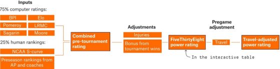
The data source that the contestants used was from FiveThirtyEight – an American website that focuses on politics, economics, opinion polling, and sports from an empirical and analytic perspective. FiveThirtyEight Men’s basketball team ratings are determined using numerous factors including both computer ratings and advanced analytics, as well as human rankings. The computer ratings include: the basketball power index, the Elo rating system, KenPom rankings, the LRMC model, Jeff Sagarin’s predictor ratings, and Sonny Moore’s computer ratings. The human components are the NCAA selection committee’s S-curve and the pre-season rankings from the Associated Press and the NCAA coaches. These factors together determine the combined pre-tournament rating, and adjustments are then made to account for injuries, tournament wins and travel distance.
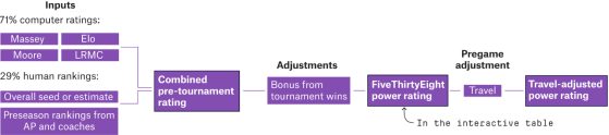
The 538 Women’s team ratings are calculated with somewhat different components and metrics because, unfortunately, there is a relative lack of attention, assessment and thus data for women’s college basketball (this is a problem that persists throughout all of women’s sports). The computer inputs for the women consist of the Massey Ratings, the Elo rating system adjusted for the Women’s tournament, Moore’s ratings, and the LRMC ratings. The human components, which make up a larger percentage of the women’s inputs, consist of a record of overall seed or estimated seed (due to the fact that the NCAA does not provide S-curve data for the women) and the preseason rankings from the AP and the NCAA women’s coaches. Similar to the men’s ratings, adjustments are made to produce the final FiveThirtyEight power rating and the travel-adjusted power rating.
At the Viz’d competition, once the data source was presented and understood, the night kicked off with the appetizer round! The task at hand was to prepare a visualization based on a ‘basket’ of basketball data that introduced the UM men’s and women’s teams as consistently strong Division 1 programs over time. There were a wide range of approaches from the contestants including bar graphs and line charts highlighting the history of positive rankings from both fantastic teams, charts comparing Michigan’s programs to other nationally recognized basketball programs, and great use of color to highlight maize and blue.
The competition judges were QMSS Director Jan Van den Bulck and QMSS Advisor Rachel McTavish. The judges provided great feedback and complimented the offerings, but they also suggested that the data chefs spice it up for the main course! For the appetizer round, the judges chose Groups 2, 4, and 7 as the winners, and the audience gave the most votes to Groups 3 and 4. Everyone did a fantastic job, and there was more to come.
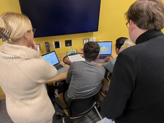
The main course portion of the competition was more intense, more challenging, and required more time to complete. It was well worth it! The task was to use the NCAA basketball data to create a chart, page, or dashboard showing the distribution of March Madness Tournament team participation by state for both the Men’s and Women’s teams. This round was more challenging, and groups had to consider potentially creating multiple charts within a dashboard, keeping their work relevant to the purpose, and deciding what forms of the dataset to show and how.
At the close of the round we saw some great maps featured on the various dashboards, but there were some groups that strayed away from the crowd and should be applauded: Group 9 decided to utilize a large bar chart with specific colors to assist their motive, Group 8 invited comparison into their dashboard, Group 3 did a fantastic job of utilizing titles and allowing the titles to highlight the story of their graphic, and Group 2’s visually appealing graphic won the audience over. Ultimately, the evening’s top three teams overall had first choice selecting from the prize table, but all contestants walked away rewarded for their efforts.
The event brought together QMSS students for a lighthearted and fun competition with fun prizes and food, but also gave an opportunity for QMSS minors and fans to engage with each other outside of the class. Maybe some people learned a little more about March Madness in the process. We can’t wait for QMSS to put on VIZ’D 2023!
Sources:
- "How Our March Madness Predictions Work". Fivethirtyeight, 2019, https://fivethirtyeight.com/methodology/how-our-march-madness-predictions-work-2/.
- "VIZ'd: A Data Visualization Competition | U-M LSA Quantitative Methods In The Social Sciences". Lsa.Umich.Edu, 2022, https://lsa.umich.edu/qmss/news-events/all-news/search-news/qmss-program-presents-viz-d--a-data-visualization-.html.