


Word Smiths
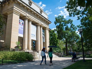
This is an article from the spring 2015 issue of LSA Magazine. Read more stories from the magazine.
LSA’s Zell Writers’ Program has its own letterpress, where students transform fiction and poetry into one-of-a-kind objects of beauty. Learning about the other side of writing—about what really happens when ink meets paper—gives students an understanding of the literal weight of their words.
This sentence is made of words, which can be broken down into letters. And while that might seem like the smallest unit that we can get to, even letters can be divided into smaller components. A “stem,” for example, is a vertical stroke, like you find on the left side of an L or an R. A “counter” is an enveloped space like the one found in an o, e, b, or d. Every week, students in LSA’s Helen Zell Writers’ Program are asked to come to a place where they very carefully consider issues like these as they choose the shape, size, and weight of their words.
That place is Wolverine Press, which I direct and helped found. Wolverine Press is a printing studio organized around a 100-year-old, 1,800-pound letterpress machine that rolls ink onto metal type that is held in frames—called chases—and presses the metal type against individually loaded pieces of paper. The process preserves the practical craft of printing as it was invented by Johann Gutenberg in the 15th century, giving student writers the opportunity to become intimately familiar with the most important elements of printing—type, ink, and paper.
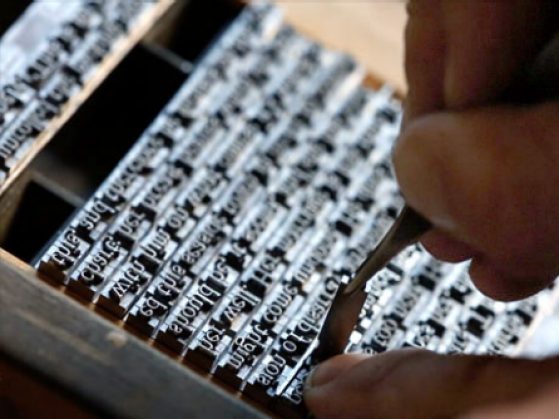
Wolverine Press purchased the bulk of its type from the estate of a Michigan printer, John Moran of Muskegon, including several tons of cabinetry and type ranging in size from 72 point (equal to one inch) all the way down to 6 point (1/12 of an inch).
It’s important work, but it takes time. We—the students and I—labor for weeks in our space to prepare an edition of a single poem, and we don’t do it just because the press is there, or because it’s old, or because we have too much free time. We do it because we believe that this kind of craftsmanship ennobles the writer whose work is printed, the printer responsible for the piece, and the reader who enjoys each final, unique product.
These values owe a lot to a man named John Ruskin.
Devils and Details
Born in 1819, Ruskin grew up in England at the height of the Industrial Revolution. In Ruskin’s England, the ancient meadows were cut open to make way for canals and railroads, the old country churches were demolished in favor of towering cotton mills, and the spring breeze was heavy with deadly chemical fogs amid the constant whine of steel lathes.
To Ruskin, the whole of the Renaissance had been a mistake. Humanism and learning had led to individualism, nationalism, and the industrial world, where both the mill owner and the workman were enslaved.
At its heart, Ruskin’s thinking grapples with how our society has divided the work of the mind from the work of the body, and thus made both kinds of labor sad and incomplete. His work spawned a revolution in aesthetics that we are still living with. Whenever you hear people talking about craftsmanship, about artisans and the preservation of traditional skills, that’s John Ruskin you are hearing echoing down through the years.
In a traditional apprenticeship, a boy (often called a “devil”) would be indentured to a master printer at the age of 12 or 13, and until the age of 21 he would labor by his master’s side to learn the craft of printing. Though a printer was a craftsman like a carpenter or a blacksmith, apprentices would learn to read, sometimes not just in English but also in Greek and Latin. One of his first jobs might be to disassemble Hamlet letter by letter through a process called “distribution,” putting each letter back into its appropriate spot in the type case. And though the letters were upside down and backwards, the apprentice would come to know his work so well that he could recite whole passages of the play by heart by the end of the printing. By the time an apprentice left his master, he would be able to compose his own short essays and stories directly in type, setting each letter by hand, hundreds of words an hour, and thousands every day.
The modern world can’t accommodate anything like the immersive experience of a traditional apprenticeship, but we give our graduate students a taste of that life. Kat Finch, a second-year graduate student, came in on the first day of last semester and immediately set to work on a poem written by one of her professors. Over the course of the first month of the semester, she set all of “To Make Various Sorts of Black” by Lorna Goodison, and enjoyed ample time to consider the placement of every letter and word in that poem.
There are four devils in the shop this year, and they work between three and 20 hours a week, depending on the scale of the work and the urgency of the deadline. The shop immerses them in the old craft of printing so that they can see their own writing from the other side.
In this way we live out Ruskin’s dictum: “It is only by labour that thought can be made healthy, and only by thought that labour can be made happy.”
Just My Type
The printing press housed at Wolverine Press was purchased by the Zell Writers’ Program in 2014. It was built around the year 1900 by the Chandler & Price Company of Cleveland and was used by the Parma News Publishing Company until it was sold to Thomas Trumble, a farmer and former employee of Parma News. It was from Trumble’s estate that the press finally came to the Zell Writers’ Program.
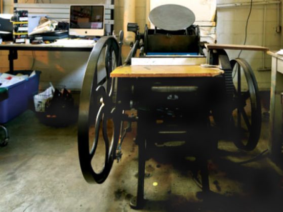
Built at the beginning of the 20th century, the Wolverine Press letterpress is made of steel and iron. The round metal plate at the top of the machine is the ink disc, and it holds fresh ink that is applied to the type just before each sheet is printed.
Since 2014, Wolverine Press has introduced 15 devils—fiction writers and poets—to the craft of printing and has produced five printed projects, including poems by Eduardo Corral, Paisley Rekdal (M.F.A. ’96), and Lorna Goodison, and an excerpt from Jane Smiley’s novel Horse Heaven. Each project was challenging and rewarding in its own way, but the press’s fifth project, completed last fall, had a special resonance for many of us: It was a story written by our beloved professor Nicholas Delbanco, printed on the occasion of his retirement.
Delbanco, the Robert Frost Distinguished University Professor of English Language and Literature, is the author of 16 novels, numerous short stories, essays, textbooks, speeches, and an endless supply of show-stopping anecdotes. He is hard to classify in terms of his importance to the University of Michigan writing community because he, more than anyone else, created it.
From the mid-1980s until the end of the century, he presided over the master of fine arts program in creative writing and directed the Hopwood Writing Awards. It was Professor Delbanco’s vision to create a community that is truly communal in character, where the students and faculty are never in competition with one another for resources or attention, but where, for three years, the pressing concerns of the banks and the businessmen can be set aside, and writers can focus on writing for its own sake. Through Professor Delbanco’s leadership and the unprecedented support of Helen Zell (’64), who donated $50 million to the master of fine arts program and for whom the program is now named, that vision is now a reality.
After 30 years of his leadership it was, of course, very sad to hear that Professor Delbanco was finally stepping down. But at the same time, when we looked around at the program we worked in, we—his fellow faculty members, his former and current students—could feel something of his satisfaction. The community is thriving. He did what he set out to do.
Because of all this, I wanted to do something special for Delbanco’s retirement. But I was limited by how much type the press did—and didn’t—have. When we type away at our computers, or even when people type away on their typewriters, we see printed letters spiraling out endlessly. But in a print shop, if I have 35 lower case a’s in 12-point Bodoni bold, then I can’t use that type to set a poem that needs 36 a’s. Even though we have literally a ton of type, there are only a few sizes and styles that we have enough letters for that can be used to set work.
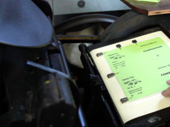
For this reason, we had focused almost exclusively on poetry before Professor Delbanco’s retirement. But the occasion inspired us. We decided that we needed to produce an edition of an entire short story, choosing his very first short story, “Composition,” published in 1979. At 2,384 words, it’s almost the same length as the article you are reading. But even a story that short—with 1,391 lower case e’s and 790 lower case a’s—was impossible to print with the type resources that we had. It was time to cast new type.
What We Live For
There are only two commercial type foundries left in America, both very small operations. Beyond that, there are perhaps 50 or 100 hobbyist type casters in all of North America. In the whole world, there may be fewer than 500.
One type caster happens to live in Washtenaw County, and he very obligingly agreed to help us cast enough type to set the whole of Delbanco’s story. One of the shop devils, Maya West (a fiction M.F.A. candidate), helped operate a nearly 100-year-old casting machine that injects molten lead from a pot heated to 700 degrees Fahrenheit into a mold. At the end of the mold, a special die is attached that prints the face of each letter onto the cooling lead. After four days of work, we had cast more than 100 pounds of type, enough to print Professor Delbanco’s story.
In addition to Nicholas Delbanco's story “Composition,” Wolverine Press has also printed the work of novelist Jane Smiley, the poems of former LSA Professor Lorna Goodison, and short editions of the literary magazine harlequin creature.
The typeface we chose was 14-point Kennerley Old Style. Kennerley was designed in 1911 by Frederic Goudy for publisher Mitchell Kennerley and is considered by most authorities the first original American typeface. We felt it matched Professor Delbanco’s important role in American letters and creative writing education.
When you examine Kennerley, you can feel the human hand in the slight bowing outward of the upper case A, or in the asymmetry of the bowls of the lower case b’s and d’s such that the d is not just the inversion of the b, but is truly a separate artistic creation. (The trailing serif of the lower case z also has a jaunty little zip to it; I recommend checking it out.)
This was the type we used to set “Composition.” As a small chapbook, the story ran for 32 pages with illustrations, plus a flyleaf and a cover. We printed an edition of 250. Setting the type took us a month and a half. It took another month to build the forms for printing, to proof the forms, and to correct the proof. And it took still another month to print the sheets, cut them, collate them, hand sew them, and glue the cover on. From the time we selected the text and prepared to cast the type all the way to the night when we delivered our edition to a dinner celebrating Professor Delbanco’s life and work, we spent eight months working on the project.
The short story is transmuted in the process. The story is not just ideas or beauty or language; it is also letters and lead and paper. It’s skill and time and sweat and love.
Here is the opening paragraph of the story, which I have been living with for almost a year:
Food, clothing, shelter, our teachers instructed us, are the three conditions of dignified survival. Man requires each. It’s a comprehensive list and makes a kind of catch-all sense, but lately I’ve found myself questioning it; why not air, for instance, or any of the things we swear we live for—art, tactile alertness, God, love?
The story is a meditation on the dichotomy between the physical world we live in and the internal spiritual and aesthetic world we live for. Our hope with Wolverine Press is that it shows our student devils, and anyone else who comes into contact with the press or one of our projects, that those worlds don’t have to be separate. We aren’t preserving the antique work of printers because it is antique; we are doing it because craftsmanship matters. In writing and in printing, that is equally, elementally true.